
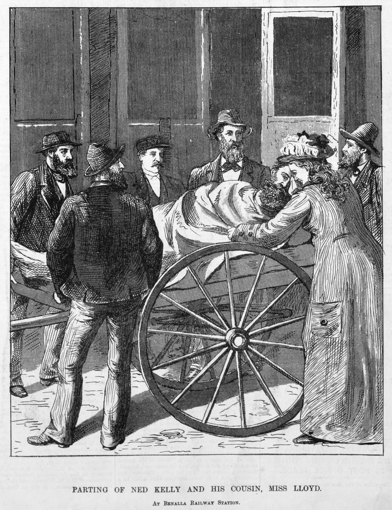
One of the things that I had planned on including in the novel from very early on was a series of line drawings to illustrate the text. I am very much a fan of any book that provides visuals to correlate with the text and in particular have a soft spot for the kind of books that are primarily text but incorporate the odd full page black and white (or colour) illustration. A prime example of this is Charles White’s History of Australian Bushranging. Presumably due to copyrights or access to certain images White provided original illustrations in his books (there are two volumes) rather than reprinting photographs or contemporary illustrations as most texts of that type do. I find this gives them, regardless of which edition it is, a distinct style that makes them immediately recognisable. You can look at any of those drawings and immediately you know where it’s from. It only adds to the experience of the literature. That’s something I want from my book too.

The quandary I have is twofold: Firstly, how many illustrations is appropriate for this book? Secondly, what sort of illustration is most appropriate to enhance the experience of reading the book?
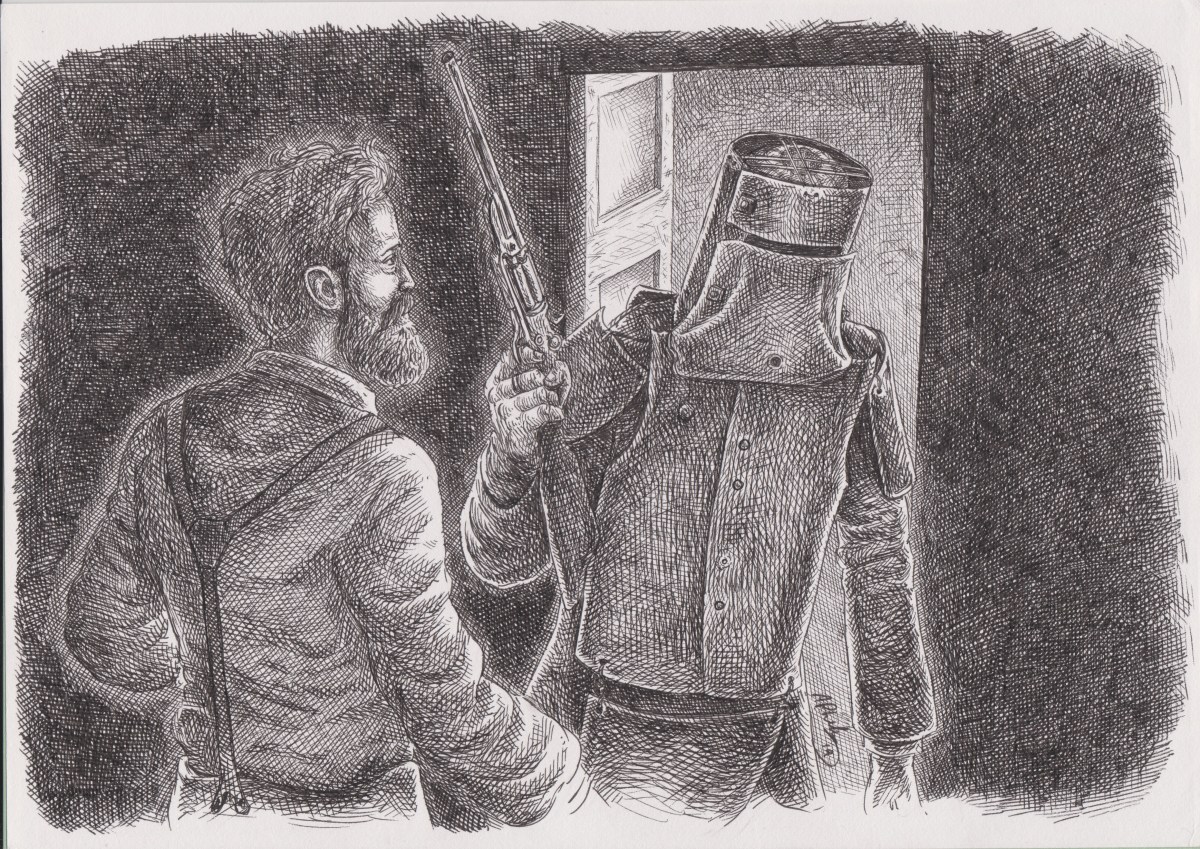
At this stage my intention is to have two illustrations per chapter. Initially it was to be one illustration in the form of a small decorative image to put at the start of every chapter (I took inspiration from novels I read as a child in regards to this.) The idea with this was to open each chapter with something a little more abstract in order to set the vibe rather than illustrate a specific moment. For example, rather than illustration a moment from the narrative it might be a gallimaufry of objects related to moments in the chapter (a pistol, a police helmet, horse’s bit, et al.) I still think it’s a solid idea but it doesn’t quite hot the spot for me.
To have full page illustrations, however, would mean choosing specific moments or characters to portray, which potentially could impact on the reader’s experience negatively if they would rather imagine what they are reading a certain way. I can’t dictate the way my work should be consumed, though in this instance I don’t think it’s that much of a problem to guide the reader’s imagination given that the things that they are reading are based on actual people and events of which we have many visual records of.

There’s also the practical consideration that the plan to do two illustrations per chapter would add more than 30 pages to the book. This will obviously impact on the printing costs, but probably not as much as I am imagining. Still, if the illustrations are good enough, maybe it will be worth having the price bumped up. If there’s a need to incorporate fewer images into the novel after I’ve done the full set I’m sure there’s a coffee table book waiting to be made there.
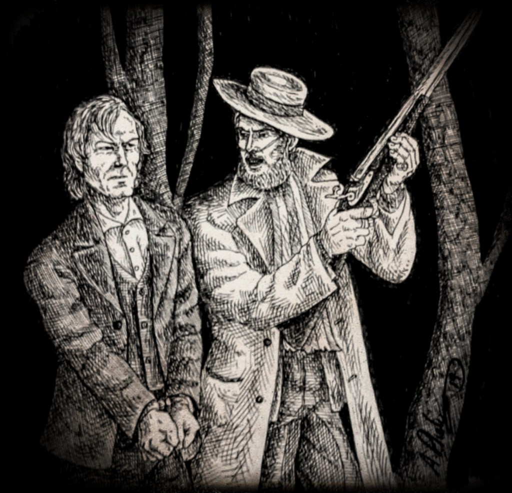
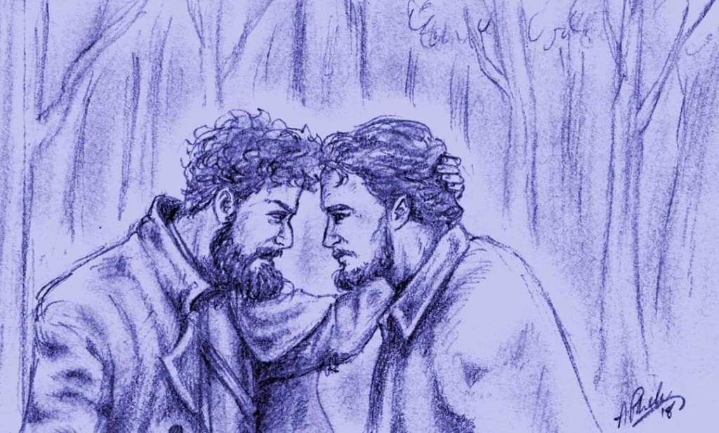
Though I do experiment with different styles, I think the illustrations in this book should hearken back to an old fashioned aesthetic to maintain the vibe of the text, which is why I want to do black and white line drawings rather than full colour, paintings, or whatnot. Apart from the reduced printing costs it really evokes the 19th century publications that used drawn illustrations because the technology to replicate photographs had not been developed (if you’ll pardon the expression.) I really want to have images that sit somewhere alongside the press illustrations and the sort of thing John Tenniel would do for Alice in Wonderland. I want to capture the drama while also keeping the imagery grounded in the reality.
As I write this I have a very strong sense of where I’m going with the illustrations but I know myself well enough to be prepared for my inevitable dummy spit when I find myself unsatisfied with the images of create. It’s all part of the process.
